The Story Behind Our New Look
Mediacurrent will turn 15 this year. We’re at the peak of our corporate adolescence and we have accomplished a lot in these 15 years. We’ve worked with some of the world’s largest brands and helped them adopt and expand their use of Open Source technology. We’ve partnered with organizations in the government and public service space to create better digital experiences for constituents across the country. We’ve been one of the most consistent contributors to the Drupal Project, brought the largest Gatsby project to life and did the fully remote team thing before it was popular.
For our upcoming 15th birthday, we decided to give ourselves the gift of a reinvention; to think deeply about the work we’ve accomplished and set our sights on new challenges and ambitious approaches.
We started by dreaming up future headlines we’d like to see mentioning Mediacurrent in the next two years. This exercise helped us see ourselves from a new angle, thinking beyond where we typically show up and imagining where we want to go. The results were varied — from a panel at SXSW to a Harvard Business Review case study — but they painted a picture of an agency taking on both larger stages and challenges than we have traditionally.

Our next exercise was to define what we are versus what we aren’t versus what we want to be. We thought about culture, services offerings, contract structures, delivery methodologies — all the pieces and parts that define an agency.

From this exercise, we rallied around some key points:
- We want to stay open source focused.
- We want to expand our market perception from being technology focused to being technology and design focused.
- We want to continue to cultivate a culture of altruistic and driven contributors who want to make an impact through their work.
With these two activities, we formed the basis of a new brand platform. A brand platform is basically what it sounds like — the foundation that a brand identity is built upon. It allows an organization to articulate its purpose and conviction, primary beneficiaries and functional distinctions. Narrowing down the scope of why you do what you do, who you do it for and why you do it differently can be challenging. We wanted to strike the right balance of reflective and aspirational, taking pride in our past accomplishments while forging an ambitious new path.
That reflection and ambition led us to two potential directions:
Positioning ourselves as an agency who works with purpose-built organizations
Throughout our history, we’ve partnered consistently with non-profits, higher education institutions, government agencies — entities who are built around serving others. We have loved building great products and services for clients like Habitat for Humanity or the State of Georgia. Focusing our business around these “purpose-built” clients would give us the opportunity to double-down on our pursuit of impact.
Positioning ourselves more broadly, as an Open Source product agency
We deeply embrace our success as one of the leading Drupal development agencies in the world; however, this would kick the Open Source door wide open. We would have the flexibility not only to explore other Open Source platforms but what it means to be an Open Source agency.
Both directions resonated with our past and our potential future. To get more input and feedback on this change, we shared both potential platforms and directions with the full agency. Using Miro, we asked everyone to weigh in on both ideas and give their thoughts on the future of Mediacurrent.

We got great feedback from the full team. People were interested in both maximizing our relationship with purpose-built organizations and in broadening our approach to Open Source beyond Drupal.
Ultimately, we rallied behind the Open Source Product Agency idea. Folks on the team were excited by the idea of looking beyond Drupal and sharing more of our work on other platforms or using other frameworks.
With a new brand platform in place, we started to look at how this would come to life visually. We used the digital Brand Deck to develop the beginnings of our brand personality. We knew we wanted to emphasize our dedication to the craft of software development, our reputation for being realistic, and our commitment to giving back to the community through our work.
We chose a format with four personality pillars, complemented by attributes that give us flexibility in expressing our personality across visual media and written content. We wanted to highlight “curiosity,” pairing it with “insightful” to support our practice of producing interesting and useful content about product development. We chose to pair “crafted” — emphasizing the high quality of our work across disciplines, with “timeless” — expressing our desire to have a flexible visual identity that wasn’t pegged to a specific aesthetic or time.

Then we started bringing the brand to life visually, starting with everyone’s favorite design activity — mood boards. We broke the brand platform and personality into three different visual directions.

Retro — Played on nostalgia by incorporating colors, patterns, and typefaces reminiscent of the late 70s, 80s and early 90s.
This direction capitalized on Mediacurrent culture using references from classic technology like arcade games, to VHS tapes, the Walkman and 8-bit design. It featured super saturated colors, blocky text and fun patterns and it communicated a sense of irreverence.

Retro Future — Featured strong use of grid layouts, limited color palettes, classic sans-serif typography and simple-shape based patterns.
This direction communicated precision, craft, and artful simplicity. We felt that using a limited color palette and ample whitespace would allow the work we produce to speak volumes about our capabilities and commitment to quality.

Future Future — Used saturated colors, interesting gradients, amorphous shapes and angular typography to create a sci-fi, cyber-punk inspired future theme.
This direction expressed our desire to advance technology through the work we do, an interest in rapid prototyping and experimenting with new ways of making digital products and experiences for our clients.
We shared the mood boards with the full agency team for feedback and an informal poll on which direction they thought was the best fit based on our new platform and personality. Retro Future was the runaway winner, but folks were also interested in incorporating some elements from the Future Future direction like the gradients.
With this feedback, we started to develop the core elements of our new visual identity. Searching for a sans serif typeface that was legible and versatile, with a bit of a retro bent, we landed on Modern Era from Family Type. We love that Modern Era includes a Monotype family that has a distinctly technical feeling.

We evolved our existing color palette into a simplified primary blue color, using it across a ten-step spectrum and pairing it with gray. Taking inspiration from Otl Aicher’s visual identity for Lufthansa, we selected what we call a “secret palette” of yellow and gold. Great complements to our core blue, but used sparingly and never for background or text.

We selected the Material Design icon set because we were drawn to its thick line weights and almost playful takes on classic icons like the asterisk, checkmark and directional arrows. The set is also Open Source keeping us true to our brand, visually and conceptually.

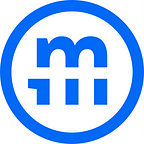
With these core components determined, we started an evolution of the Mediacurrent logo. The original logo was designed by Mediacurrent co-founder Paul Chason and it has gone through several evolutions throughout our history. As we looked to evolve it again, we wanted to pay homage to Paul’s original design while using elements from our new visual identity to make it into the anchor piece of a responsive brand.

Using Modern Era Mono, we created a new simplified wordmark in all lowercase — a slight nod to both the serif type used previously and the look of text editors for development. The Modern Era Mono “m” is the basis for our new mark (or as we call it, “the badge”), featuring a bold strikethrough (like the original Mediacurrent current), protected in a circle to give it weight and space.
The wordmark and badge are intended to be used separately. Except for when they’re used together in a combination we call “the trademark.”

Pulling all of these elements together, we created the new Mediacurrent Visual Identity System — which we are now rolling out across our website, social platforms, marketing collateral, branded merchandise, proposal decks and especially our booth for DrupalCon Portland.

To be true to our updated positioning as an Open Source Product Agency, we’re going to start sharing more of how and why we do the things we do. More thoughts on that idea here: Why Open Source?
We are really excited to see how far we can take the new Mediacurrent brand both visually and strategically. We’re ready to expand our definition of Open Source, forge new relationships with partners and clients, share more about our process and output and celebrate our successes.